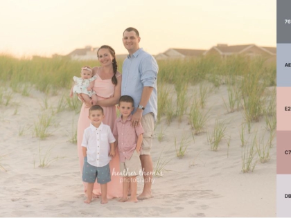
6. The Natural Harmony of Green and Beige
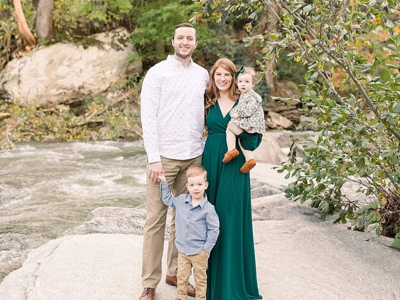
The combination of green and beige in family photography creates a harmonious and natural color scheme that can work exceptionally well in various settings, particularly for outdoor and country-themed photoshoots. This palette draws inspiration from nature, with green representing the lush foliage and vitality of the natural world, while beige adds a touch of warmth and sophistication. The success of this color scheme, however, greatly depends on the specific setting chosen and how the colors are balanced within the composition.
In a country-themed family photo, the green and beige color scheme can create a perfect backdrop that complements the natural setting. The green elements in the photograph can echo the surrounding vegetation, whether it’s rolling hills, dense forests, or open meadows. This creates a sense of unity between the subjects and their environment, resulting in images that feel organic and authentic. The beige components, which could be incorporated through clothing choices or props, add a touch of refinement to the rustic setting. This combination allows families to appear well-coordinated and stylish without seeming out of place in a natural environment.
For outdoor family photos in the spring or summer, the green and beige color scheme truly shines. The vibrant greens of the season provide a lively backdrop that symbolizes growth, renewal, and the bonds of family. Beige clothing or accessories can stand out beautifully against this verdant background, creating a pleasing contrast that draws attention to the family members. This color combination also works well with the warm, golden light often found during these seasons, particularly during the “golden hour” just before sunset, enhancing the overall warmth and intimacy of the family portrait.
When considering this color scheme for indoor family photos, it’s crucial to ensure that the green tones are light enough not to overwhelm the composition. In an interior setting, softer sage or mint greens can be more appropriate than deep forest hues. These lighter greens can be incorporated through background elements, such as wall paint, draperies, or carefully chosen props. Beige can then be used as the dominant color for clothing or furniture, creating a sense of warmth and comfort in the indoor space.
The versatility of the green and beige color scheme allows for creative interpretations across different styles of family photography. For a more formal portrait, deep emerald greens paired with rich, creamy beiges can create an elegant and sophisticated look. In contrast, for a casual, relaxed family photo, lighter sage greens combined with soft, sandy beiges can evoke a sense of ease and naturalness.
When implementing this color scheme, it’s important to consider the balance between the two colors. While both green and beige can be used as dominant colors, they often work best when one takes the lead and the other serves as an accent. For example, family members could be dressed primarily in various shades of beige, with green incorporated through accessories, props, or background elements. Alternatively, a predominantly green setting could be complemented by family members wearing beige clothing, creating a striking visual contrast.
The texture of the materials used can also play a significant role in enhancing the green and beige color scheme. Natural fabrics like linen, cotton, or wool in beige tones can add depth and interest to the composition, while also reinforcing the connection to nature. Similarly, incorporating different shades and textures of green through elements like leaves, grass, or textured backgrounds can create a rich, layered effect in the photograph.
Lighting is another crucial factor to consider when working with green and beige. Natural, diffused light can enhance the organic feel of this color scheme, bringing out the subtle variations in both the green and beige tones. In outdoor settings, the changing light throughout the day can dramatically affect how these colors appear, with early morning or late afternoon light often providing the most flattering illumination.
For those seeking inspiration on how to effectively incorporate green and beige into their family photographs, the portfolio of McSween Photography offers excellent examples. McSween’s work demonstrates a nuanced understanding of how to balance these natural tones, creating images that are both visually appealing and emotionally evocative. By studying the work of experienced photographers like McSween, families and aspiring photographers can gain valuable insights into the subtleties of working with this nature-inspired color scheme.
In conclusion, the green and beige color scheme offers a versatile and timeless option for family photography. Its ability to create a sense of harmony with natural surroundings, while still allowing for individual expression and style, makes it an excellent choice for families looking to capture memories in a way that feels both authentic and aesthetically pleasing. Whether used in outdoor settings or adapted for indoor portraits, this color combination can help create family photographs that are both beautiful and meaningful, capturing the essence of family bonds in a visually striking manner.