5. The Versatile Appeal of Beige with Pops of Color
The use of beige as a base color with strategic pops of vibrant hues creates a versatile and timeless color scheme for family photographs. This approach offers a neutral foundation that allows for endless creative possibilities, making it suitable for a wide range of settings, seasons, and family styles. The beauty of this color scheme lies in its ability to create a cohesive and balanced look while still allowing for individual expression and personality to shine through in the photograph.
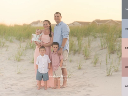
Beige, with its warm, neutral tones, serves as an excellent backdrop for family portraits. It provides a soft, understated elegance that doesn’t compete with the subjects of the photograph, allowing the focus to remain on the family members and their interactions. The calming nature of beige can help create a relaxed atmosphere during the photoshoot, encouraging natural expressions and genuine moments between family members. This neutral base also has the advantage of being flattering to a wide range of skin tones, ensuring that everyone in the family photograph looks their best.
The real magic of this color scheme comes from the strategic use of pops of color against the beige background. These bursts of vibrant hues can be incorporated in numerous ways, depending on the desired mood and style of the photograph. For a subtle approach, small accessories like scarves, jewelry, or hair ribbons in bright colors can add just the right amount of visual interest without overwhelming the composition. More bold interpretations might include statement pieces of clothing in vivid colors or the use of colorful props and background elements to create focal points within the image.
One of the greatest strengths of this color scheme is its adaptability to different seasons and settings. In spring and summer, pops of pastel colors like soft pink, light blue, or pale yellow can create a fresh and airy feel to the family portrait. For autumn photoshoots, rich jewel tones such as deep red, orange, or emerald green can be used to echo the changing colors of nature. Winter family portraits can incorporate cool blues, silvers, or even festive reds and greens for a holiday theme, all while maintaining the neutral beige base.
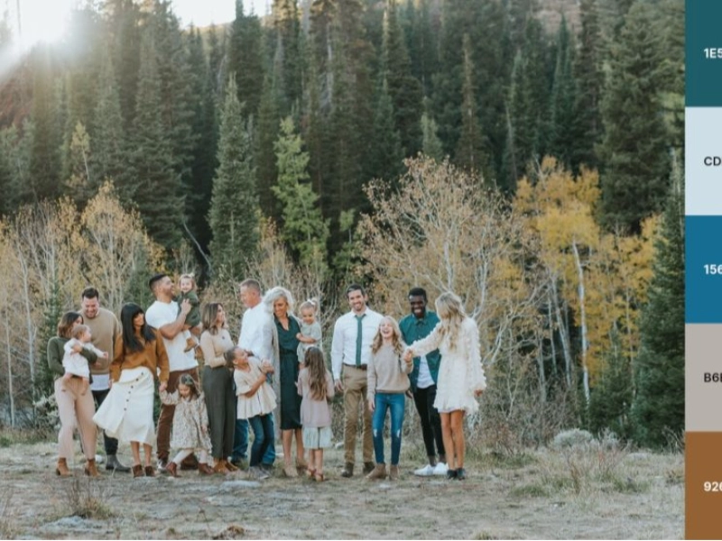
The versatility of this color scheme extends to both indoor and outdoor settings. In a studio environment, a beige backdrop can be easily complemented with colorful props, furniture, or lighting effects to create a variety of moods and styles. For outdoor photoshoots, the natural environment often provides its own pops of color against neutral clothing choices. A family dressed in varying shades of beige can be beautifully offset by a vibrant blue sky, lush green grass, or the colorful blooms of a flower garden.
When building a color scheme around beige, it’s crucial to choose complementary colors that work well together and reflect the personality of the family. For example, a beige background could be accented with pops of blue, green, and pink to create a fresh and lively composition. Alternatively, a more sophisticated look could be achieved by pairing beige with deep purples, rich browns, and touches of gold. The key is to select a color palette that resonates with the family’s style and the overall mood they wish to convey in their photographs.
To effectively implement this color scheme, consider varying the textures and tones of beige used in the photograph. This can include everything from creamy off-whites to deeper taupes, creating depth and interest even within the neutral base. The pops of color should be distributed thoughtfully throughout the composition to create balance and guide the viewer’s eye through the image.
For those seeking inspiration on how to effectively use beige with pops of color in family photography, the work of Kristi Alyse Photo offers excellent examples. Alyse’s portfolio showcases a masterful use of this versatile color scheme, demonstrating how it can be adapted to create images that are both visually stunning and emotionally resonant. By studying the work of experienced photographers like Alyse, families and aspiring photographers can gain valuable insights into the nuances of color composition and learn how to adapt this flexible color scheme to their own unique vision and style.
One of the key advantages of using beige with pops of color is its ability to create a timeless look that won’t quickly become dated. While fashion trends and color preferences may change over time, the classic combination of a neutral base with carefully chosen accents has enduring appeal. This makes it an excellent choice for family portraits that are intended to be cherished for years to come, as the photographs will continue to look fresh and relevant even as styles evolve.
When implementing this color scheme, it’s important to consider the overall balance and composition of the image. The pops of color should be used strategically to draw attention to key elements of the photograph, such as the faces of family members or meaningful props that tell part of the family’s story. By carefully planning the placement and intensity of these color accents, photographers can create a visual hierarchy within the image that guides the viewer’s eye and enhances the overall impact of the portrait.
Another consideration when working with this color scheme is the importance of lighting. The right lighting can dramatically affect how beige and other colors appear in a photograph. Soft, diffused lighting can enhance the warmth of beige tones and create a gentle, inviting atmosphere. In contrast, more dramatic lighting can be used to create bold shadows and highlights, adding depth and dimension to the image. Experimenting with different lighting techniques can help photographers discover new ways to bring out the best in this versatile color palette.
In conclusion, the combination of beige with pops of color offers a flexible and enduring approach to family photography. Its ability to adapt to various settings, seasons, and personal styles makes it an excellent choice for families looking to create memorable portraits that will stand the test of time. By carefully considering the balance of colors, the use of texture and tone, and the overall composition of the image, photographers can use this color scheme to create stunning family portraits that capture the unique personality and dynamics of each family they photograph.