
1. The Harmonious Blend of Blue and Pink
Blue and pink, two colors that sit opposite each other on the color wheel, create a visually striking and harmonious combination that has become increasingly popular in family photography. This complementary pairing offers a perfect balance of cool and warm tones, making it an ideal choice for a wide range of photographic settings and styles. The cool, calming nature of blue serves as an excellent counterpoint to the warm, inviting qualities of pink, resulting in images that are both visually appealing and emotionally resonant. When used thoughtfully, this color scheme can evoke a sense of tranquility and joy, making it particularly well-suited for capturing the essence of family bonds and shared moments.
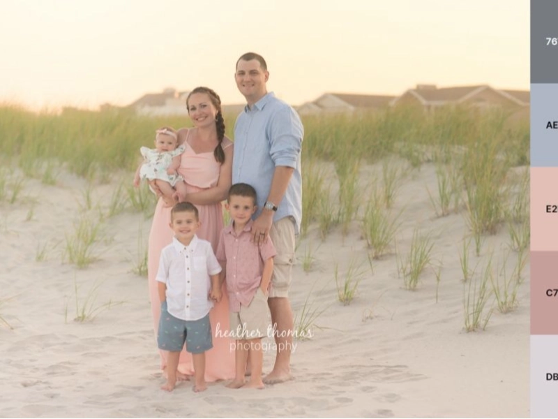
The versatility of the blue and pink color scheme is one of its greatest strengths, allowing it to be adapted to various seasons and locations. For outdoor family photoshoots during the summer or spring months, this combination is particularly effective. Imagine a family strolling along a sandy beach, with the azure blue of the ocean serving as a natural backdrop. The family members, dressed in varying shades of pink, would stand out beautifully against this blue canvas, creating a visually striking and memorable image. The beige of the sand would complement both the blue and pink tones, adding depth and warmth to the overall composition. Similarly, in a spring setting, the blue could represent clear skies or a serene lake, while pink could be incorporated through clothing choices or by including blooming flowers in the frame.
While outdoor settings provide a natural canvas for the blue and pink color scheme, it’s important to note that this combination can be equally effective for indoor photoshoots. In a studio or home setting, blue and pink can be used to create a casual, relaxed atmosphere that encourages natural interactions and genuine expressions. The key to success in indoor settings is to carefully consider lighting and background choices. Soft, diffused lighting can enhance the soothing qualities of blue, while strategic use of pink accents can add warmth and energy to the composition.
To maximize the impact of the blue and pink color scheme, it’s crucial to avoid a “matchy-matchy” approach. Instead of dressing all family members in identical shades of blue and pink, consider using a range of tones within each color family. This approach adds depth and visual interest to the photograph while maintaining a cohesive overall look. For example, one family member might wear a deep navy blue, while another opts for a softer sky blue. Similarly, pink tones could range from pale blush to vibrant fuchsia. By varying the shades and intensities of blue and pink, you can create a rich, layered visual effect that captures the unique personalities within the family unit.
For those seeking inspiration on how to effectively incorporate the blue and pink color scheme into their family photos, the work of Heather Thomas Photography provides excellent examples. Thomas’s portfolio showcases a masterful use of these complementary colors, demonstrating how they can be employed to create images that are both visually stunning and emotionally impactful. By studying the work of experienced photographers like Thomas, families and photographers alike can gain valuable insights into the nuances of color composition and learn how to adapt this versatile color scheme to their own unique vision and style.