9. Blue and pink
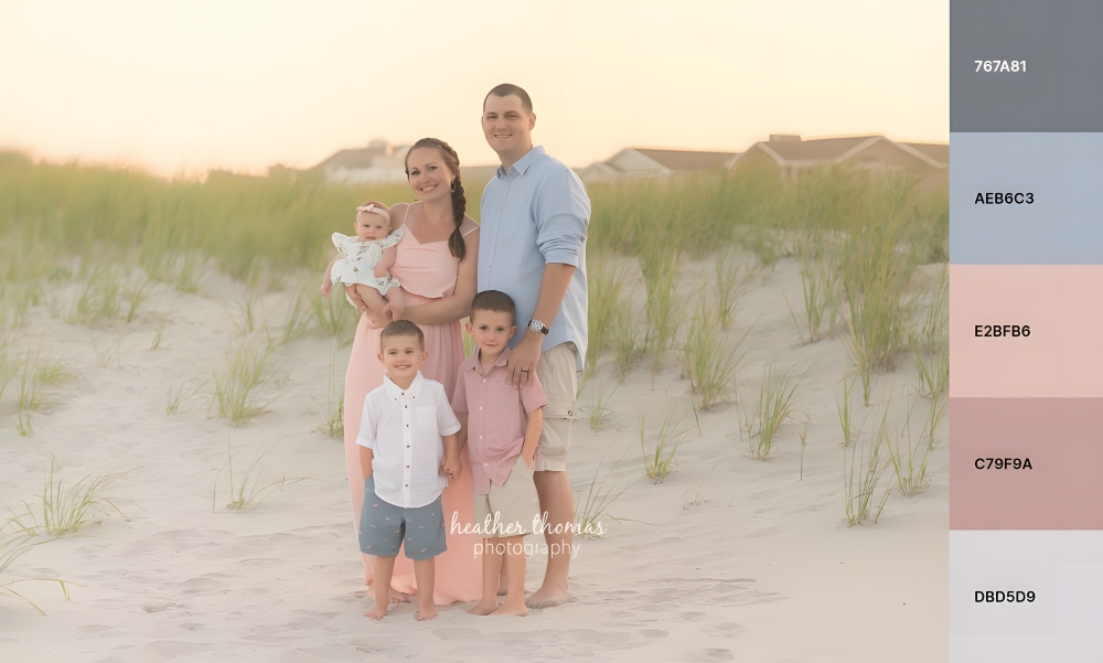
Blue and pink are complementary colors since they’re opposite on the color wheel, so the two naturally go well together. The blue adds a touch of coolness to the photo, while the pink add warmth, balancing out the temperature.
The blue and pink color scheme is ideal for outdoor family photos in the summer or spring, just as a trip down the beach, as the colors complement the beige of sand and the blue of the water. But they can also be worn indoors for a casual photoshoot.Just make sure to use different shades of blue and pink since you don’t want the colors to be too matchy-matchy.
Check outHeather Thomas Photographyfor more inspiration.
10. Black and gold
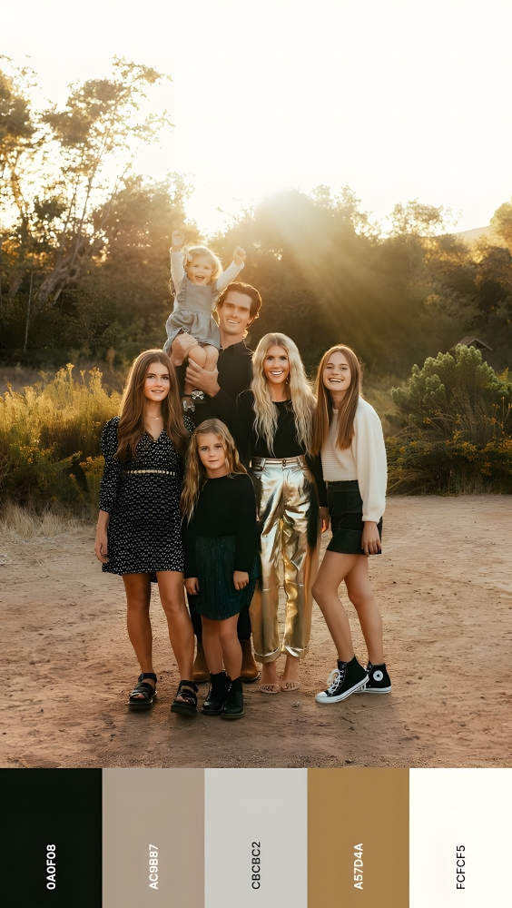
Black and gold is a classy color scheme that works well for elegant family photos, making them look more formal and expensive. The black evokes sophistication, while the gold instills luxury.
You can also use the black and gold color scheme for a holiday family photo. For instance, black complements Christmas decorations, while gold makes everything feel festive.
When picking the black and gold family photo color scheme, it’s important to balance the colors well. Too much black darkens a picture while too much gold could make it look tacky.
Check outArielle Levy Photofor more inspiration.
11. Burnt orange, dark green, and mustard yellow
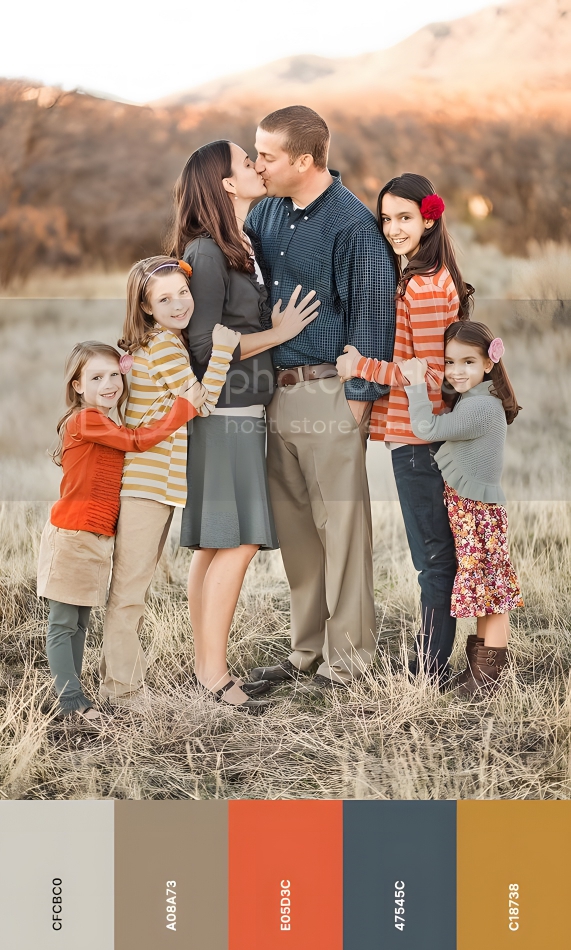
Burnt orange, dark green, and mustard yellow make the perfect color scheme for country-themed family photos. The burnt orange adds a touch of warmth, the dark green gives the feeling of rustic sophistication, while the mustard yellow adds a touch of playfulness to the mix.
This color scheme works well for an outdoor family photoshooting session in the fall since the colors complement the natural setting.
To avoid making the photo look too busy, you should use burnt orange as the dominant color and the others as accents.
Check outShanna Michelle Photographyfor more inspiration.
12. Dark purple and emerald green
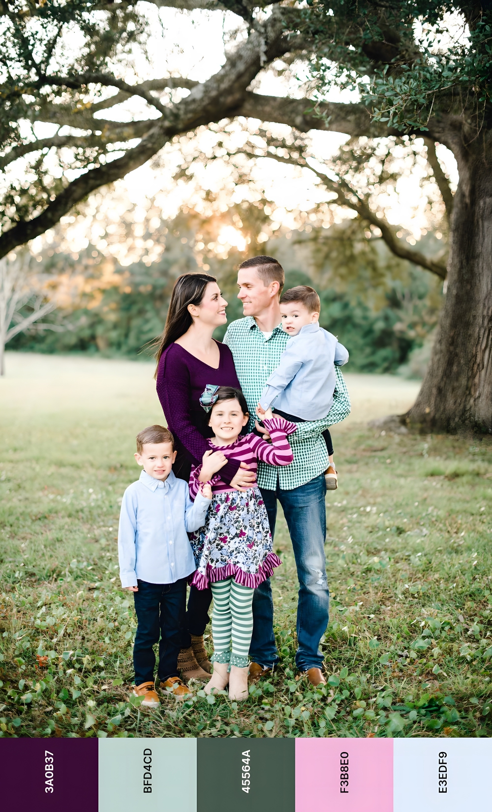
Dark purple and emerald green are complementary colors since they sit opposite on the color wheel, which means that they naturally go well together. These colors are incredibly popular for weddings, so it’s no surprise that they are also a great choice for family photos.
The dark purple adds a sprinkle of elegance to the pictures, while the emerald green makes them seem more playful. You can use the color combination both indoors and outdoors.
To avoid making the photo feel too heavy from a contrast standpoint, you should use a lighter shade of purple.
Both colors can be used as accent colors throughout the photo, so make sure to choose the version that suits you best.
Check outNatalie Zepp Photographyfor more inspiration.
13. Beige with pops of color
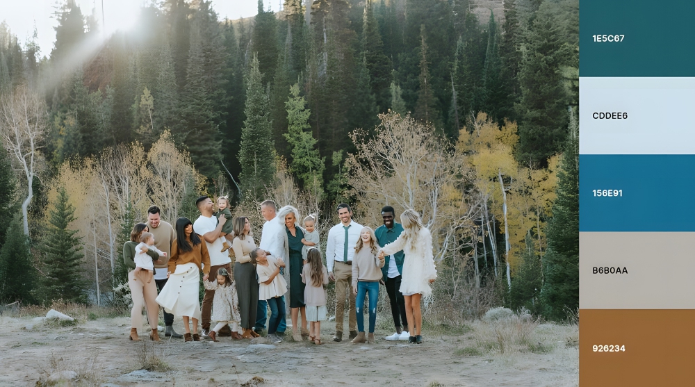
Beige with pops of color makes an incredibly versatile color scheme for family photos, regardless of the season and whether they’re taken indoors or outdoors. The color scheme could be for clothing, props, or even the background.
When building a color scheme around beige, be sure the colors youchoose complement each other. For example, you could use a beige background with pops of blue, green, and pink.
Check outKristi Alyse Photofor more inspiration.
14. Green and beige
The green and beige color scheme can work well for family photos, but it greatly depends on the setting you choose.For example, if you’re going for a country-themed family photo, then a green and beige color scheme would work perfectly since green complements the natural setting while the beige adds a touch of sophistication.
Green and beige also work well for an outdoor family photo in the spring or summer. The green complements the foliage while the beige adds a touch of warmth.
If you’re looking to use this color scheme for an indoor family photo, then you should make sure the green is light enough to not overwhelm the photo. The beige can be used as an accent color throughout the photo.
Check outMcSween Photographyfor more inspiration.
15. Navy and pink
Navy and pink are a great color combination for a summer family photoshooting session. The navy complements the blue of the sky, while the pink throws some playfulness in the mix.
The best part is that you don’t have to wear navy and pink in this exact combination. Instead of matching your clothes to this color scheme, you can use it as a guide for the overall tone of the photo. For example, if you’re going to take an outdoor family photo, then you could dress everyone in white and use navy and pink as the dominant colors in the background. This would create a beautiful contrast that would really make the photo pop. Or you can use navy and pink as the dominant colors in the foreground, with a white background. This would create a more subdued contrast that would be perfect for an indoor family photo.
Check outCasey James Photographyfor more inspiration.
16. Medium gray, ruby red, and emerald green
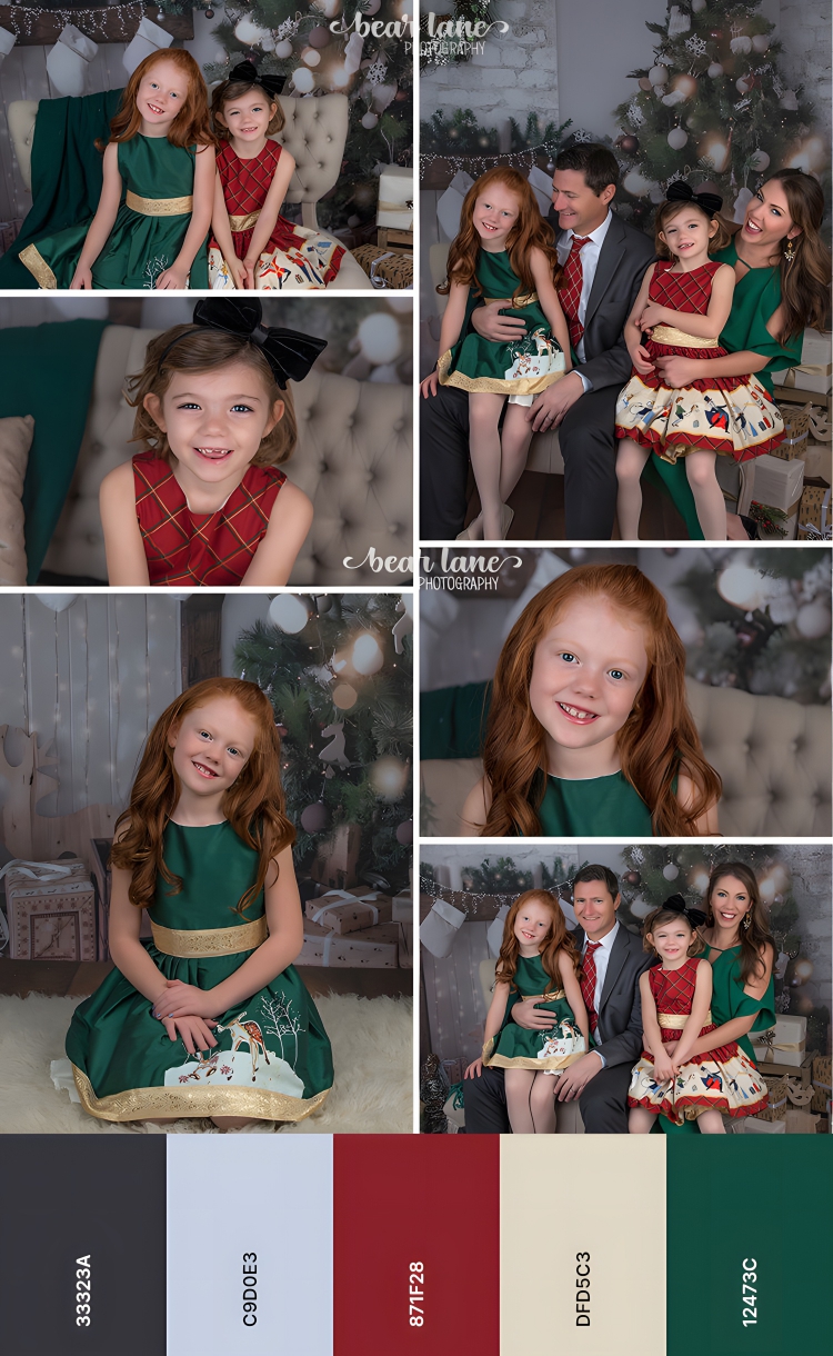
Medium gray, ruby red, and emerald green make an ideal color scheme for holiday family photos. The medium gray gives the photo a touch of sophistication, while the ruby red and emerald green add some festive cheer.
You can use this color scheme in a number of ways. For example, you could use medium gray as the dominant color and ruby red and emerald green as accent colors. Conversely, you could use ruby red and emerald green as the dominant colors and medium gray as an accent.
The medium gray, ruby red, and emerald green color scheme also work well for fall photoshoootings. The medium gray complements the cool tones of the season, while the ruby red and emerald green add warmth.
Check outBear Lane Photographyfor more inspiration.
17. Plaid
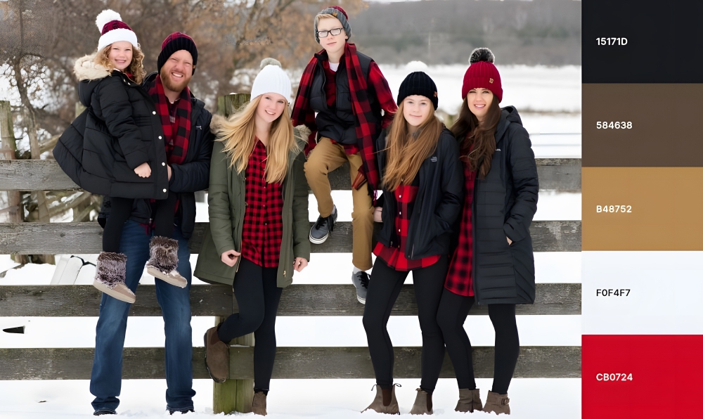
Plaid is perfect for country-themed family photos since it adds a touch of rustic charm and makes the event more memorable. The multi-colored, cross-lined pattern is popular among families who have a lot of children since tartan is a very forgiving pattern that can be easily coordinated.
If you’re going to use plaid in your family photo, then you should make sure that everyone is wearing a different pattern. This will add visual interest and make the photo more unique. You can also use plaid as an accent, like a plaid scarf or blanket in the background of an outdoor family picture. This would add some depth and texture to the photo.
Check outMJ’s Off the Hook Designsfor more inspiration.
18. White and royal blue
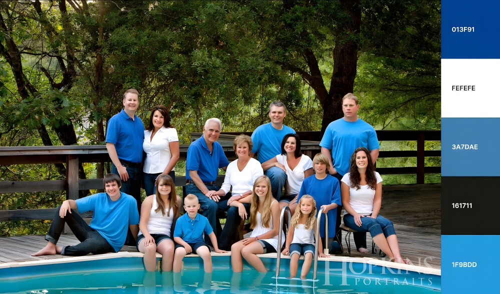
White and royal blue create a fantastic color scheme for summer family photos since the white reflects the heat of the summer sun, while the royal blue adds refreshing coolness. Plus, the white prevents the photo from looking overloaded, making it perfect for large families.